Client
- Smokie Lee
Challenge
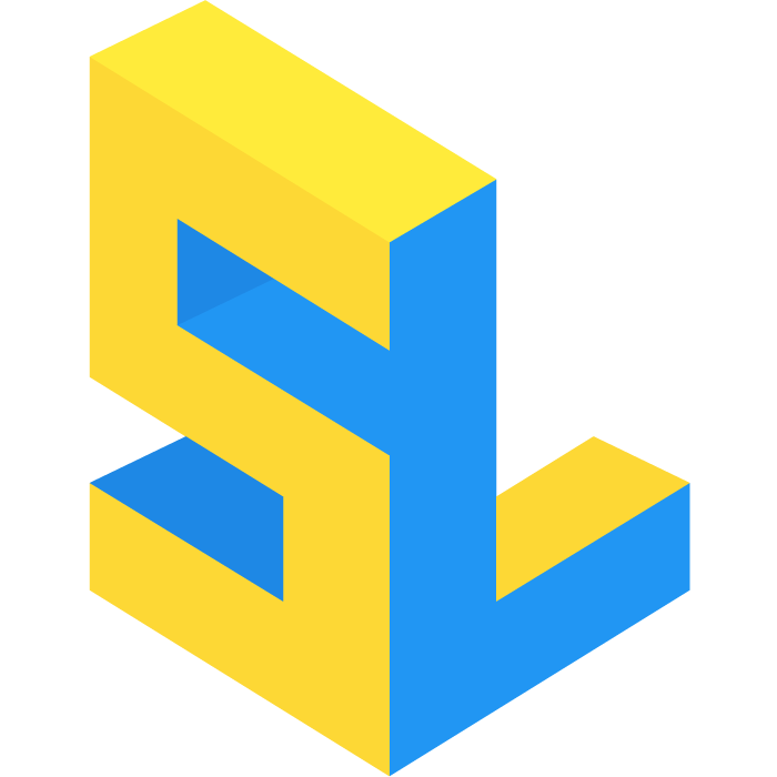
The challenge here was to create a logo that reflects my personality and the quality of my work concisely, while also being distinct enough to differentiate my brand among others’. I wanted it to be something that I would think was cool if I saw it on a Dribbble logo search. I mean, it’s my logo after all, I should like it. It should also be creative but precise, something that speaks to the precision of my work. It should include my name or initials, and be versitile enough to use as a logo in both digital and printed materials, as well as a variety of different configurations (i.e. horizontal versus vertical). Whew.
Process
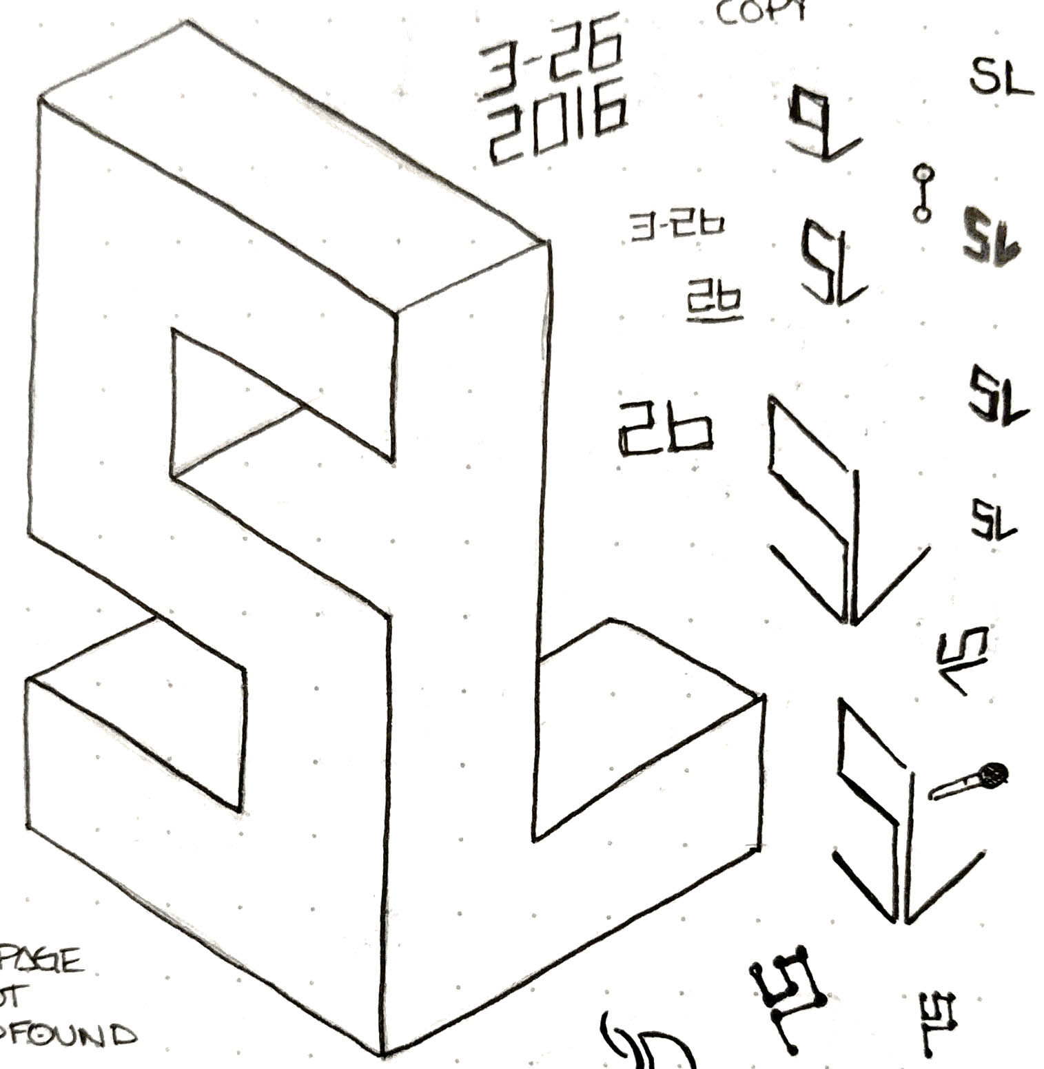
I started out researching what other front-end developers and designers are doing. Most of the front-end developer and designers I follow work for a company, so they don’t really have a need (currently) for a logo or a brand. Freelance developers seem to have a logo less often than designers, and perhaps that speaks to the engineering background versus a design background for these roles, traditionally at least. However, I’m pretty much in the middle. I’m like the SASS of front-end. So I decided that I would have a logo, and set myself apart from both engineers and solely front-end developers. Plus I wanted a logo damnit. I made a few different versions of logos that I crowdsourced on Twitter and amongst my friends, and the general opinion was that the kind of surreal, optical illusion block version was the best.

The color selection was easy: I love blue, and yellow used to be my favorite color as a kid. Not only that, but culturally blue is perceived as cool, calming, loyal, professional, rational, and intelligent, while yellow is energetic, fun, powerful, and happy (Colours in Cultures, Color meaning and context). These two colors give a nice balance with each other and have some very nice shades and tints that can create a very rich and dynamic color palette.
Result
As you can see, the result is what I’d like to think of as a pretty decent logo! It works equally well (without modification) as a website favicon or on printed material like business cards. It conveys professionalism but also a bit of whimsy, as well as being vibrant and eye-catching. It shows precision and creativity, and I think it fits my personality pretty well (other than not saying the f-word every 5-ish minutes).
