Client
- Smokie Lee
Challenge
After going to a couple local meetups for Springfield Creatives (where I’m the website content coordinator) and the .NET group (where I sometimes go to meetings and mooch free pizza and listen to amazing tech talks), I realized that I needed some business cards. While the production of the cards would be a small challenge unto itself, the design was pretty straightforward. I did have the advantage of a close relationship with the client, which is always helpful. =)
Approach
- One-sided
- Full color
- Include logo and colors from personal branding
- Include only email and website
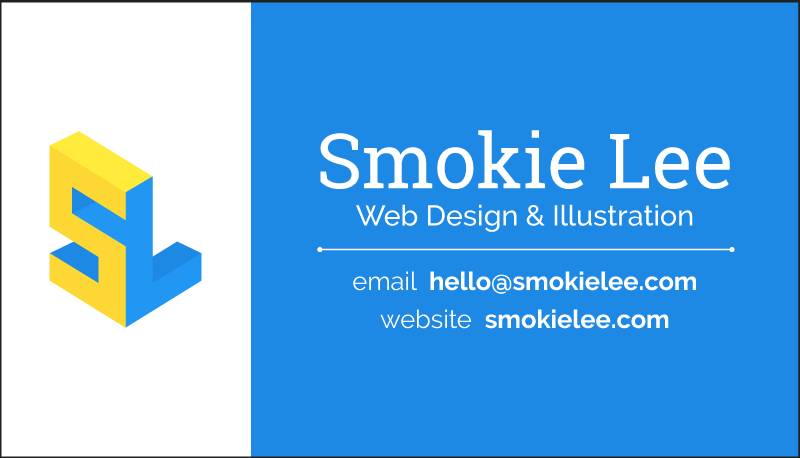
I knew that for this first run of cards I needed to stick with a one-sided solution for cost purposes, but this meant that I could have a full-color design so I felt it was a fair trade. I decided to include only my email and website on the card, as my website has links to my other profiles and that way I can receive more domain authority on my freelance business website. Plus, it makes it clear to clients how I prefer to be contacted: email or website. Of course, if I’m wrong, it’s relatively easy to change later and add more contact information to the next run of cards. The design of the card should capture the attention of potential clients, reinforce my brand among current clients, and also be a reflection of my personality and the work I do. All of which is a longer way of saying the card needed to do what all business cards do: quickly get a brand across to clients in a small, disposible, non-digital space.
Process
I used Illustrator, starting out with my ancient CS4 copy and moving to CC 2017 in March when I finally just buckled down and invested in a copy. After crowdsourcing some opinions on Twitter, Slack, and Discord, I decided to use my block version logo for branding, and started to design around that. Colors came from the color palette for the website, which in turn was built from the logo. It’s all circular, man.
Since I’m a freelance designer and I do business under my own name, my name is my brand so it has almost equal prominence with the logo. The blue background helps balance out the less graphic side of the card, and the white text breaks up and anchors the blue nicely. Glancing at the card, you can see that my logo, name, and contact information all jump out at you (in that order).
Result
Of course, designing is only half the battle for business cards and I had to find a place to print. After being recommended there by my good friend Jordan, I went with a local print shop called The Copy Shoppe and I can’t recommend them enough. I’m a bit biased, but I love the result. My friends like it too, and the one client I’ve been able to give a card to also enjoyed it. The design came out exactly like I intended it to, and that’s a pretty good result already.
Analyze
I haven’t really tested it “in the wild” so to speak, but looking at it while writing this post I have some changes I’d likely make if I were to do a 2.0 of this version. I’d probably lengthen the line saying what I do and shorten the line separator to draw your eye down the text more, and increase the contrast between the color shades in the logo. I would also increase the logo area and decrease the text area to achieve a bit more balance between the two while not making them completely equal. And I have a whole new iteration on this design for the time when I finally do a 2-sided run.
If you want to hire me, get in touch!
