Client
- Tacit OTS
- Website
Challenge
One of the first things I did for Self Interactive was to make a logo for our immersive training software, Tacit. Tacit is a virtual reality training program that helps businesses improve training and safety by immersing them in virtual reality training that simulates their actual work environment.
We discussed how the logo needed to look to potential clients:
- Must incorporate VR
- Should incorporate people or training / education
- Sturdy but not rigid or severe
- Must work in multiple differing verticals
Process
Like all my logo design, the first thing I did was grab a pencil and paper and get to work sketching. I iterated on a lot of ideas that utilized people and / or VR, and even a few that indicated blueprints or assembly instructions.

After a few (cough) sketches, I narrowed it down to my favorites. These all included stylized text, and most of them included a “T” as a monogram of sorts.

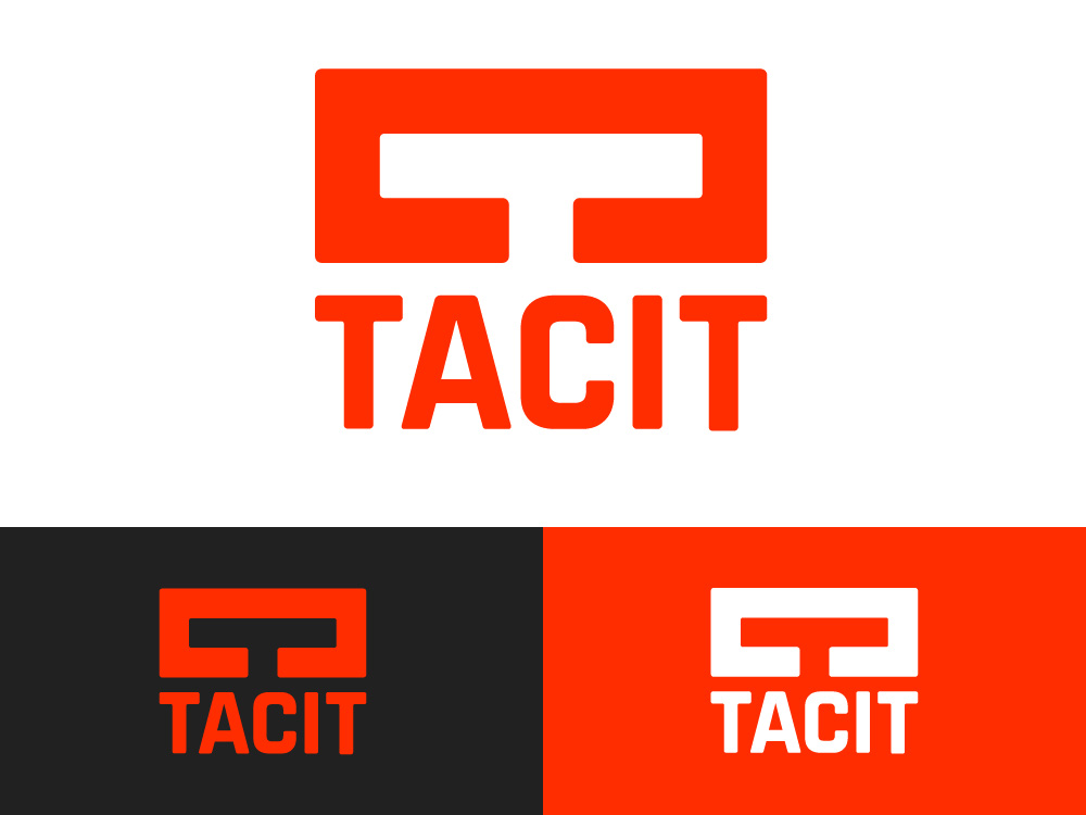
We ultimately decided on the first in these sketches, where the “T” looks like a pair of VR googles. While recognizable as a “T” to anyone, we felt the googles were subtle enough to be a nice “aha!” moment when people finally saw it. Of course, the googles would be more obvious as immersive technology becomes more ubiquitous, which we were also fine with!
Once we decided on the ultimate design, it was time to get to vectorizing.
Results


