Client
- Port42
- Website
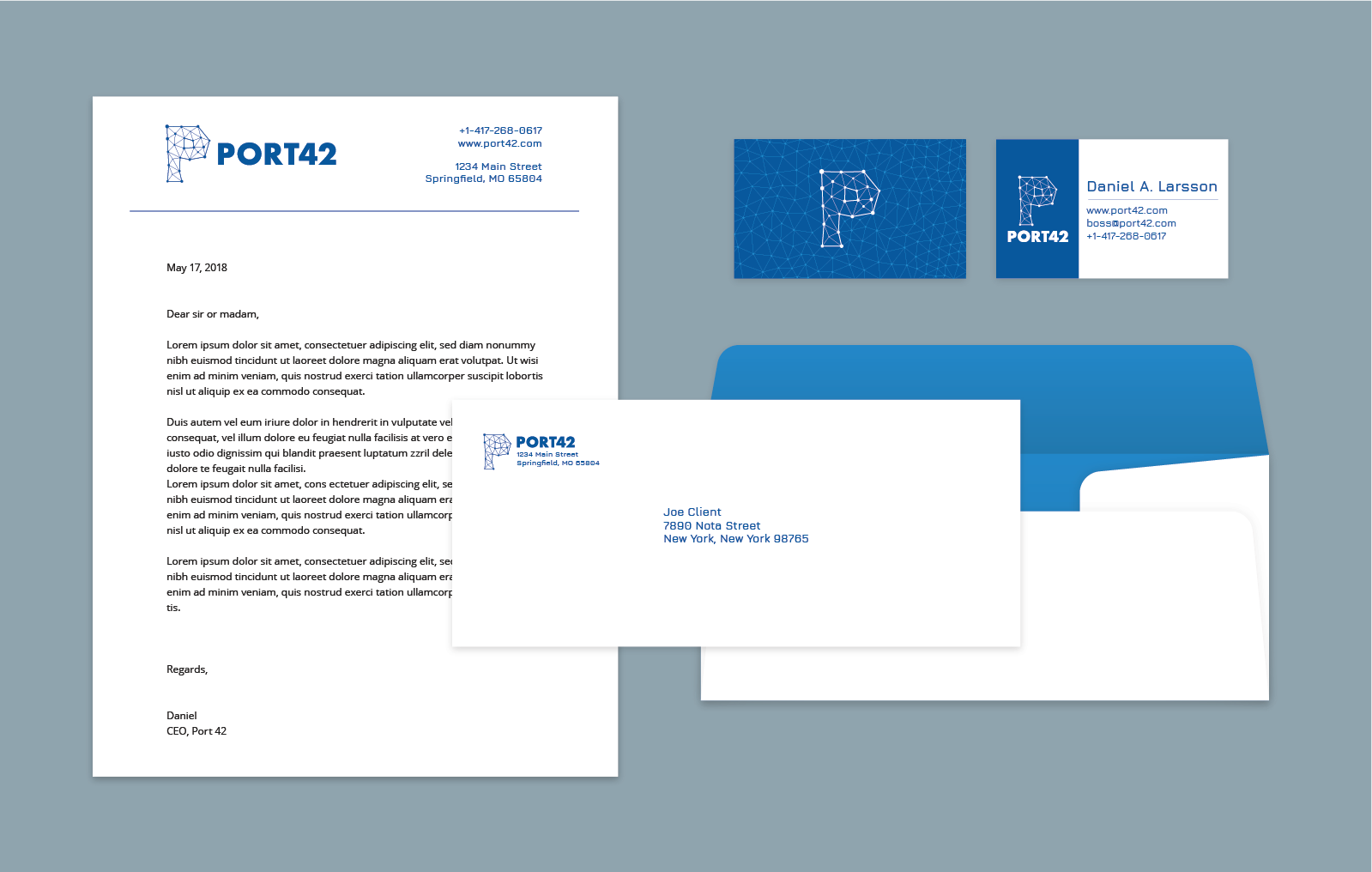
Port42 is a cryptography company that needed branding and collateral design (business cards and letterheads). The owner wanted the logo to be technology related, and generic enough that he could later expand to providing other online services without rebranding.
The client picked a few sketches to see in vector format.
And the final version.
Once he picked his final logo, it was time to design some collateral and create a branding guide.