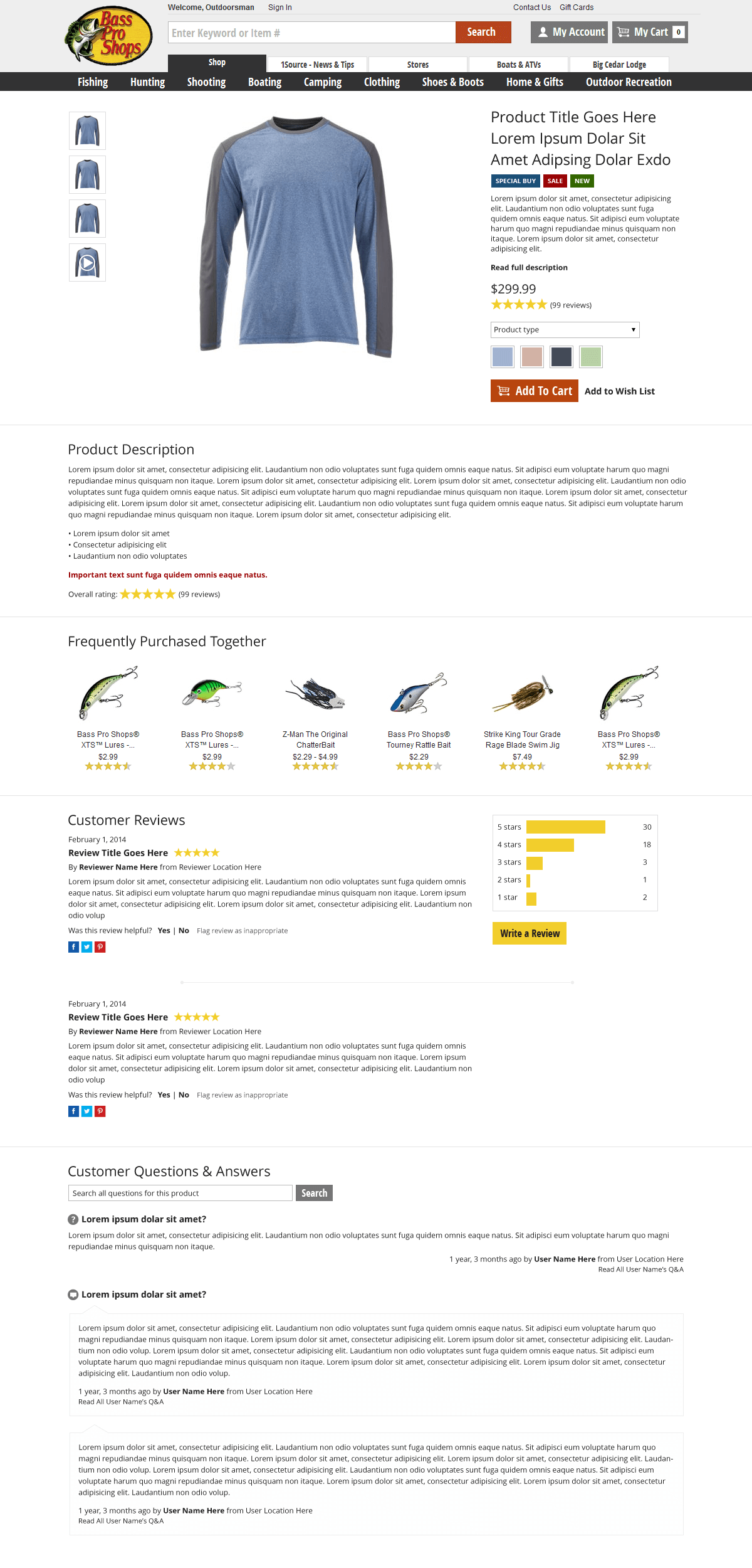
Client
- Bass Pro Shops
- Website
NOTE: This is an incomplete piece and was never officially presented to Bass Pro Shops for consideration.
Challenge
In 2014, while working on optimizing the CSS (a project that got postponed indefinitely) I started envisioning a product page redesign for Bass Pro Shops. The current product page was created in 2012 when the big site redesign happened, and while it was acceptable for that time and place, it wasn’t holding up well under evolving user needs. Since this wasn’t a requested project I had an open canvas for design, which was quite rare.
Approach
On any ecommerce product page, your most important action is adding the product to your cart; you want to make this as easy and natural as possible. Obviously you can’t put all the product information in front of the customer all at once* so you have to determine the best balance of information to let new customers make an informed purchasing decision and past customers get the product as quickly as possible.
Process
Since I was limited in maximum width, I opted to remove the right column where suggested items are typically shown (shifting them downward and horizontal) in favor of making the most vital information easier to find. Putting the product views (the small thumbnails beside the main product image) on the side of the viewer was a usability test I wanted to run if the design was approved.
I switched the vertical layout of most of the information to horizontal to make it easier to read. Customer reviews and the question and answer area are currently “tabbed” and therefore half the content is visibly hidden from users all the time. The horizontal layout brings this content to the front while not cluttering up the page. Since these elements load already on the current page but are simply hidden visually, this wouldn’t have been a performance hit either; a true UX win!
