Client
- Bass Pro Shops
Back when I worked for Bass Pro Shops, I was tasked with redesigning the gift card page. The page design was incredibly outdated, and ultimately we wanted to make the landing page as informative and actionable as possible regardless of a user’s familiarity with the gift card process on basspro.com.
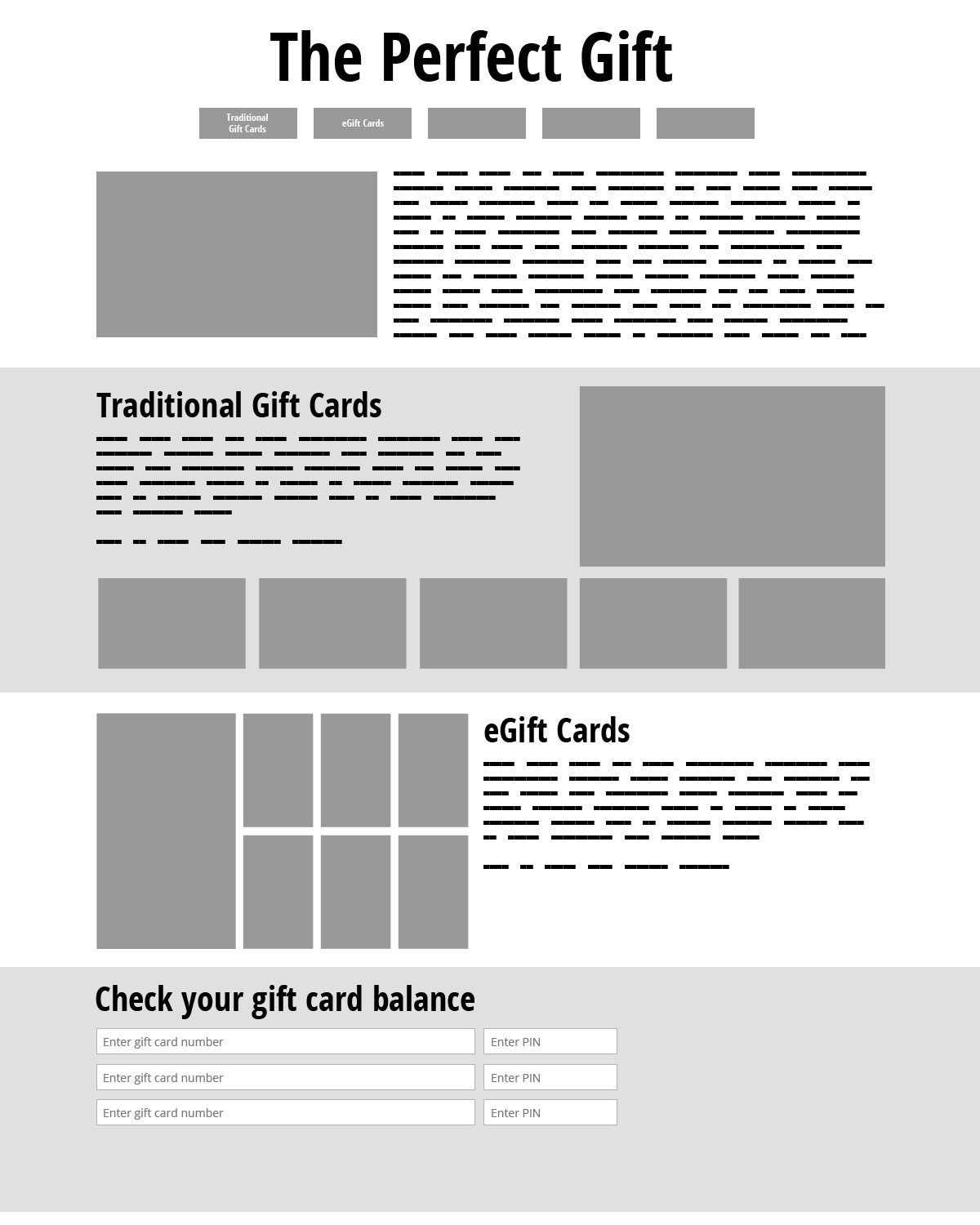
During the first round of design, I had been asked to update the layout of the page to a more modern look, but retain all of the information and as much of the user flow as possible. At this point in the project, the design was basically taking the current columnar layout and making it horizontal for that oh-so-2014 look and making everything appear to be full screen. (Due to a site-wide content restriction of 1000px this was just visual trickery, but welcome to 99.9% of all design!) I added the horizontal navigation to function as a “quick jump” bar to the different sections of the page and to act as a pattern bridge for the later responsive version (since the site itself was not responsive we couldn’t make responsive design a priority, but we tried to future-proof as much as we could).

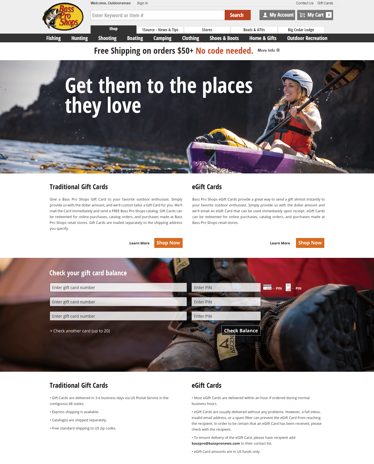
After the first wireframe, the decision was made to redesign the entire user flow. Due to structural reasons, we didn’t wireframe the entire flow and instead jumped right into mockups, one of which you can see below. I chose imagery that conveys a feeling of adventure and that subtly shows off the gear you can buy with the gift card for a little subconscious nudge.

As things often do, something with a higher priority came up and this project was put on the backlog before we could start coding anything. I wasn’t happy with the user flow we had, and I hadn’t really been able to dedicate as much time as I would normally have liked to the mockup, but such is life.
